
Eight packaging design trends for 2025
Packaging design trends for 2025 are all about bold creativity, playful confidence, and storytelling that sticks. From clever cutouts and marker pen mascots to dreamy sunset color palettes, this year’s designs invite brands to have fun and create packaging that captivates, connects, and leaves a lasting impression.
1. Clever Cutouts
Innovative Shapes That Reveal and Intrigue
Die-cut windows and shapes do more than show the product—they become part of the brand story.
- Example: A gourmet nut brand might use a cutout shaped like a nut cluster, instantly giving customers a sneak peek at the contents while reinforcing product identity.
- Insight: Use precision die-cutting to reveal distinctive textures or colors. Experiment with layered cutouts to create depth or add surprise elements that engage tactilely.
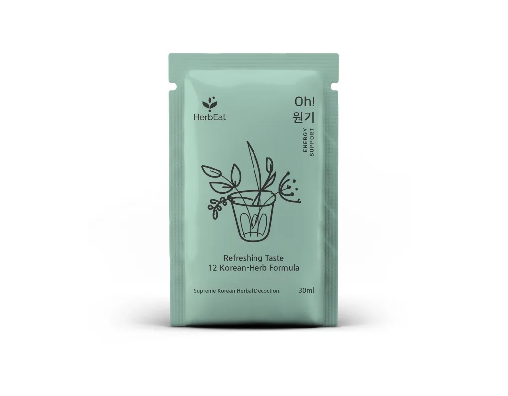
2. Simplistic Scribbles and Etches
Hand‑Drawn Charm in Minimalist Forms
The imperfect line, the rustic sketch—this style conveys authenticity and handcrafted care.
- Example: A boutique skincare line might feature subtle, hand‑etched botanicals on matte stock, creating an artisanal vibe.
- Insight: Stick to monochrome or dual‑tone palettes to let minimalist illustrations shine, and choose uncoated paper stocks to enhance that raw, tactile feel.
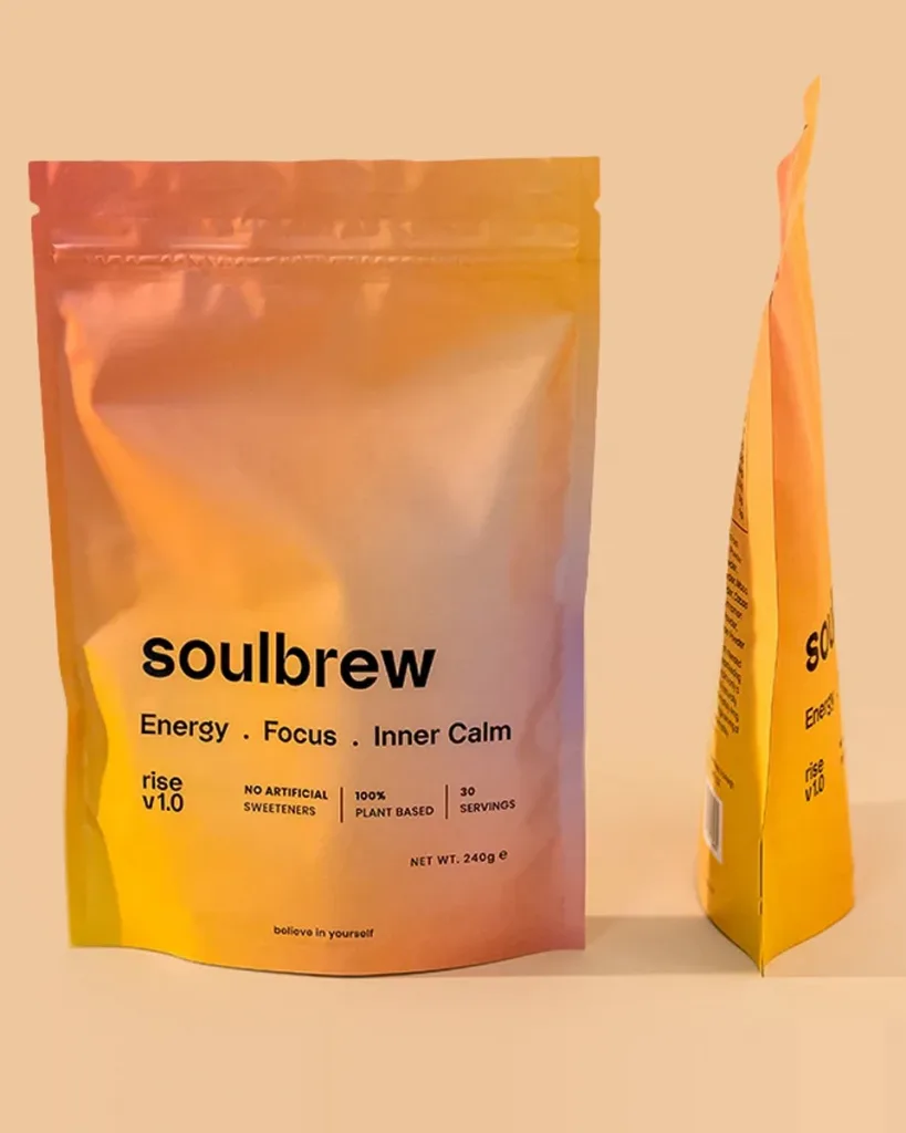
3. Sunset Gradients
Warm Color Blends That Evoke Emotion
Soft transitions from warm pinks to deep purples can evoke feelings of calm, romance, or nostalgia.
- Example: A limited edition beverage line could use a dawn‑inspired gradient to highlight new flavors or seasonal releases.
- Insight: Keep gradients smooth and subtle—avoid banding by using high‑resolution printing and consider spot‑UV gloss to enhance the visual depth.
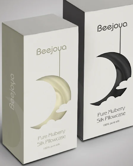
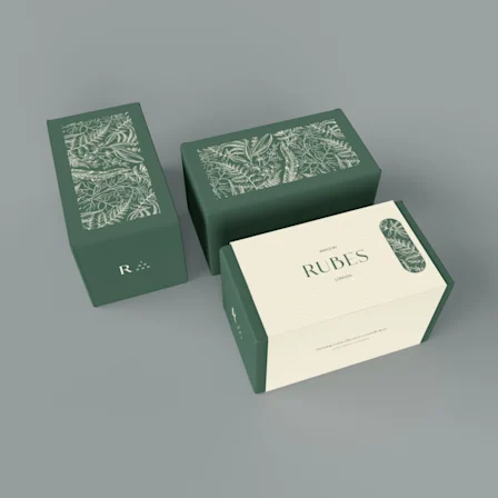
4. Curated Frames
Packaging That Poses Like Art
Much like a gallery frame, this layout draws the eye and lends a premium, collectible feel.
- Example: A small‑batch tea company might inset their logo and flavor profile within a refined metallic foil border, balancing tradition with luxury.
- Insight: Consider adding foil stamping, embossing, or debossing along with clean typography to evoke sophistication without clutter.
5. Twisted Sustainability
Eco‑Conscious with a Design Twist
Sustainability doesn’t mean sacrificing style—reset expectations with innovative materials.
- Example: Toothpaste tablets in refillable steel tins lined with plant‑based PLA, boldly labeled “Refill Not Landfill.”
- Insight: Highlight eco‑benefits on the front—e.g., “100% recycled kraft + seed‑embedded inner wrap.” Encourage reuse with playful instructions or prompts.

6. Back to Your Roots
Cultural Heritage Meets Modern Shelf Appeal
Tapping into cultural motifs transforms packaging into a narrative of identity.
- Example: A spice brand using traditional Kutch embroidery patterns from Gujarat, balanced with modern labels and typography.
- Insight: Collaborate with local artisans, celebrate craftsmanship, and remain respectful—cultural homage should be authentic and well‑researched.
7. Marker Pen Mascots
Bold, Hand‑Drawn Characters Take Over
Whimsical, marker-style mascots make brands friendly, fun, and instantly memorable.
- Example: A playful juice brand featuring fruit mascots sketched in bold strokes—each character has its own quirky personality.
- Insight: Build a consistent mascot family with color‑coding per flavor. Use fun taglines (“Berry funny!”) to build brand voice across social media and in‑store displays.
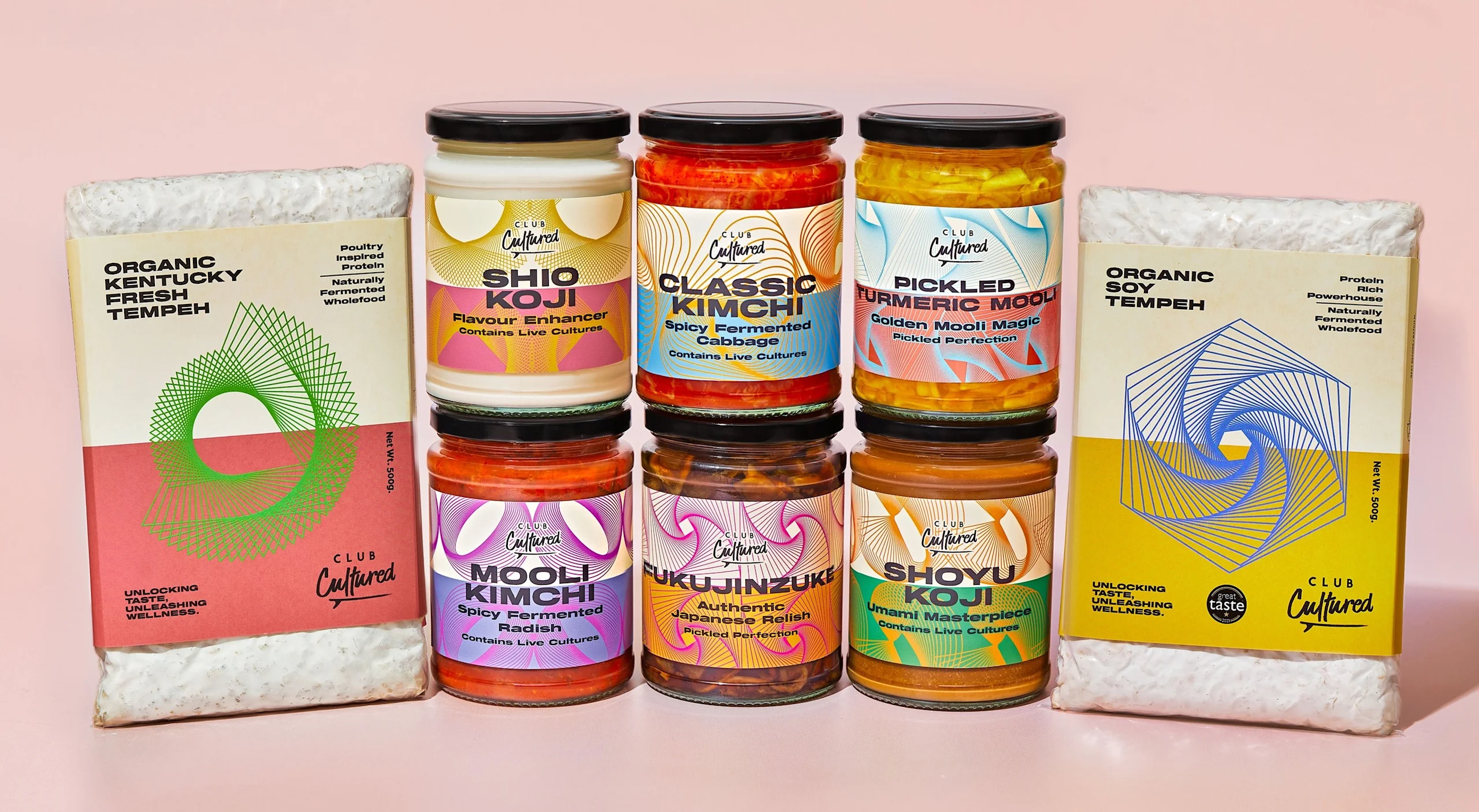
8. Fruity Hues
Juicy Color Palettes that Pop
Bright, fruit-inspired palettes trigger freshness and appetite immediately.
- Example: Frozen dessert bars in vibrant watermelon pinks, kiwi greens, and mango oranges—each wrapper echoes the flavor.
- Insight: Pair sugary pastels with vivid accents to heighten appetite appeal. Matte tactile sleeves contrasted with glossy fruit imagery add sensory depth.
✨ Creative & Strategic Takeaways
| Trend | Key Purpose | How to Leverage |
|---|---|---|
| Cutouts | Engage & reveal | Use die-cut shapes to showcase unique product features |
| Scribbles | Authenticity | Opt for imperfect lines and minimal palettes |
| Gradients | Emotional resonance | Match gradient direction and tone to brand mood |
| Frames | Elevated presence | Combine metallic accents with gallery-style layouts |
| Sustainability | Eco-awareness | Front-load sustainable messaging, enable reuse |
| Roots | Cultural connection | Partner locally, research thoroughly |
| Mascots | Memorable branding | Keep consistent across messaging & touchpoints |
| Fruity Hues | Visual pop | Use tactile printing effects to enrich color experience |
The standout packaging design trends for 2025 put personality and authenticity front and center. Whether it’s the playful charm of Marker Pen Mascots and Simplistic Scribbles, the bold innovation of Twisted Sustainability, or the cultural depth of Back to Your Roots, brands are embracing design that resonates on a human level. This year, packaging isn’t just a container—it’s a story waiting to be told.
Leave a Reply